Google UX Design Professional Certificate Project
Project duration: 3 weeks
🎯Challenge:
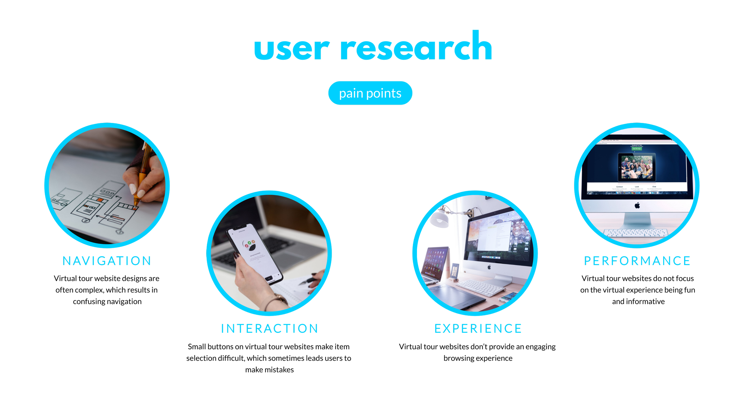
Available online virtual tour websites have cluttered designs, inefficient systems for browsing through virtual tours, only a few assistive features, and confusing checkout processes.
📌Project goal:
Designing a virtual tour website to be user-friendly by providing clear navigation and offering a fast checkout process.
My role: UX designer leading the Artica website design from conception to delivery.
Artica Virtual Tours is a Website that offers virtual tours for art galleries with affordable ticket pricing. The typical user is between 25 - 45 years old.
research
persona
user journey map
sitemap
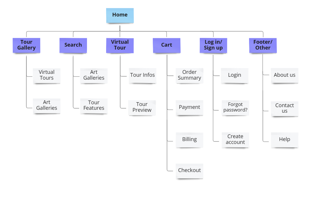
Goalssimple navigational structureimproved overall website navigation
wireframes
✨Stars were used to mark the elements of each sketch that would be used in the initial digital wireframes.
Refined paper wireframe
screen size variations
digital wireframes
low-fidelity prototype
usability study findings
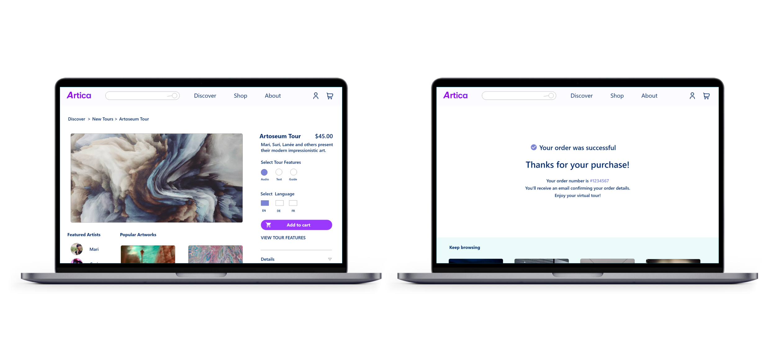
mockups
before usability study
after usability study
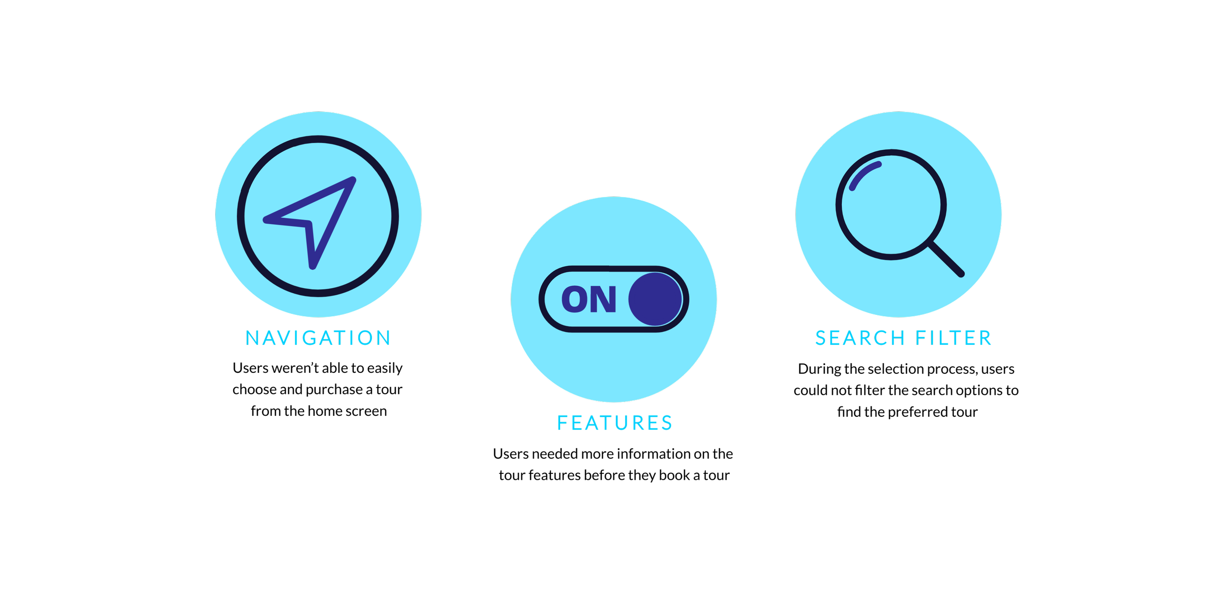
I made changes to improve the search flow. I added the shop option to the navigation bar and a filter function.
before usability study
after usability study
For an easier checkout flow, I added an info box on the virtual tour features.
original screen sizes
screen size variations
high-fidelity PROTOTYPE:
Adobe XD
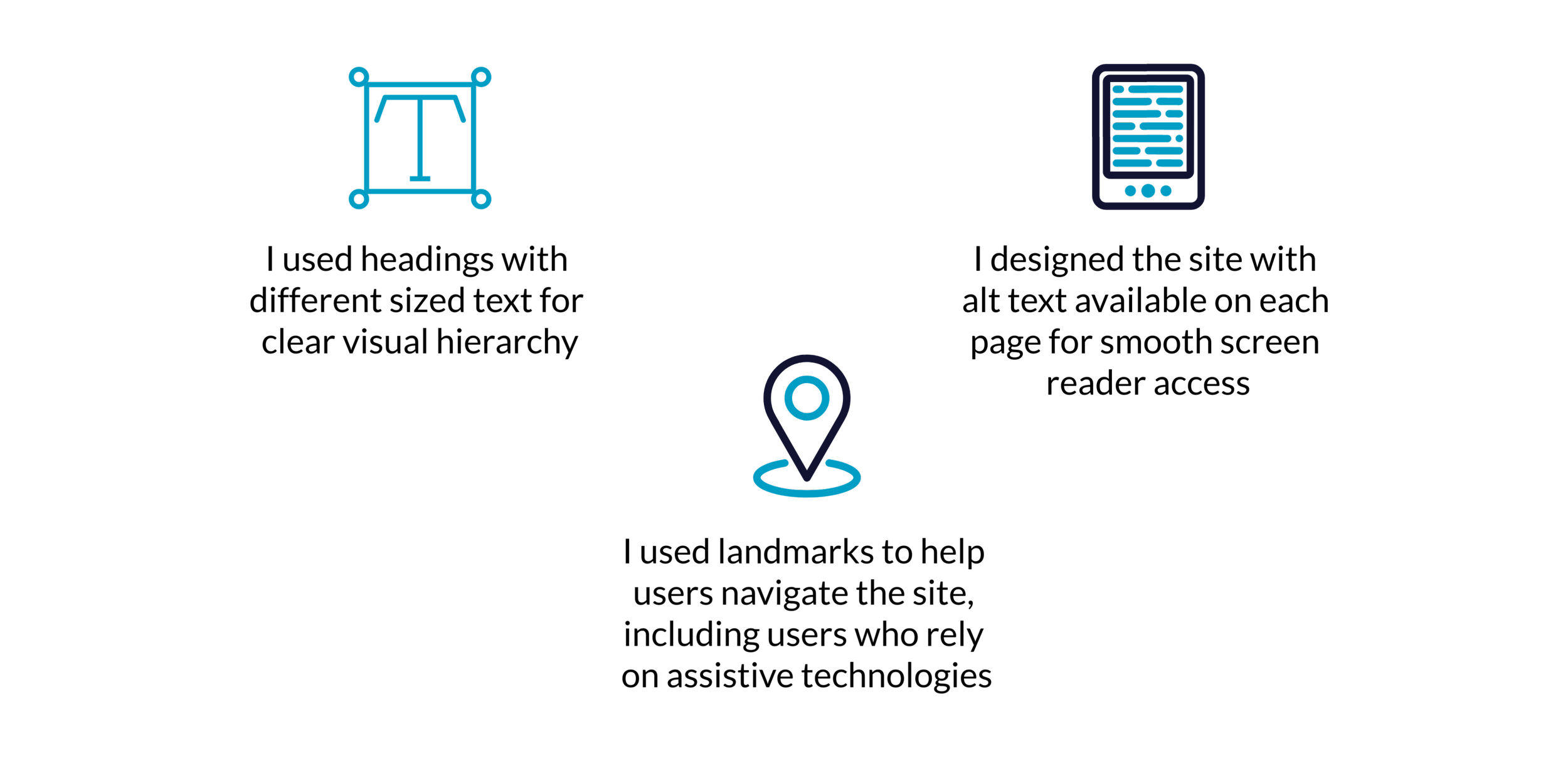
accessibility considerations
takeaways
👉The most important takeaway for me is to always focus on the real needs of the user when coming up with design ideas and solutions.
Impact:
Our target users shared that the design was intuitive to navigate, more engaging with the images, and demonstrated a clear visual hierarchy.
What I learned:
I learned that even a small design change can have a huge impact on the user experience.
next steps
Conduct follow-up usability testing on the new website
Identify any additional areas of need and ideate on new features
