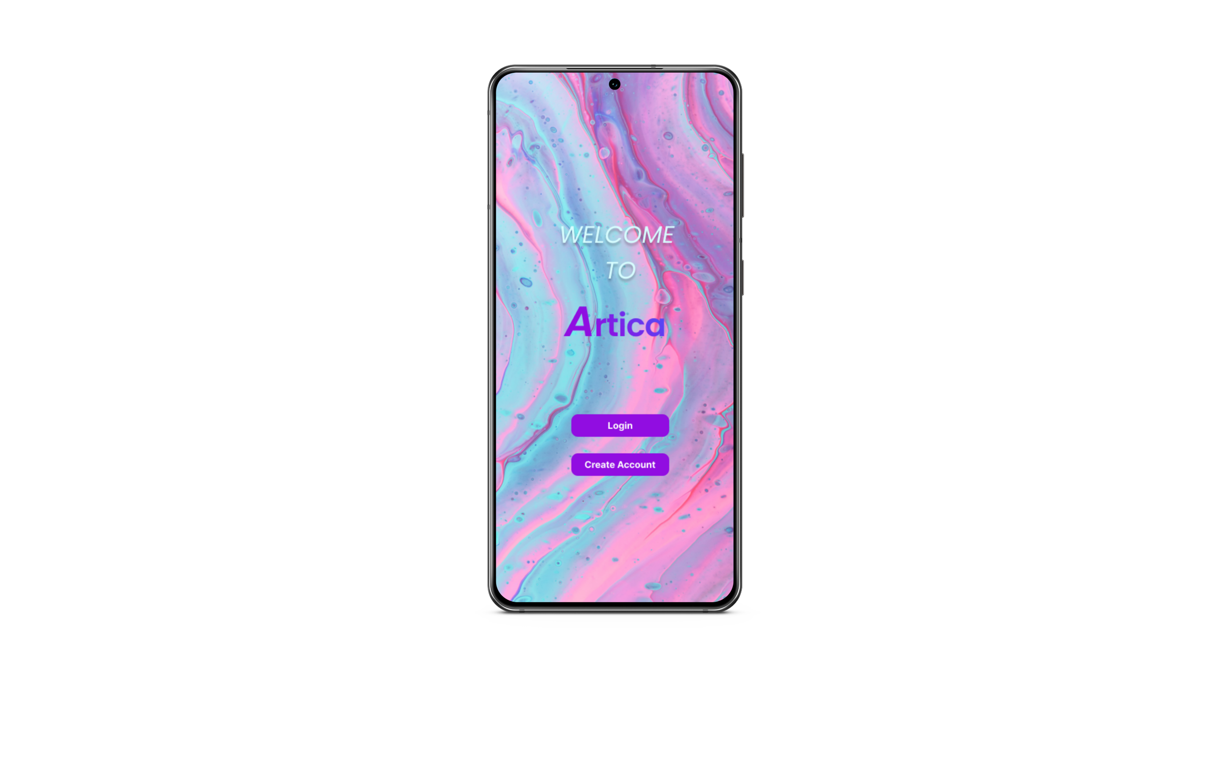
Simply book virtual tours
For this 4 weeks long project, I worked on finding ways for people to easily book and access a virtual tour for art galleries.
My role as a UX designer was to design a virtual tour app for art galleries from conception to delivery.❎Challenge: During the pandemic crisis, cultural activities like visiting an art gallery were widely restricted. Virtual tours were available only for some art galleries with few assistive technological features.
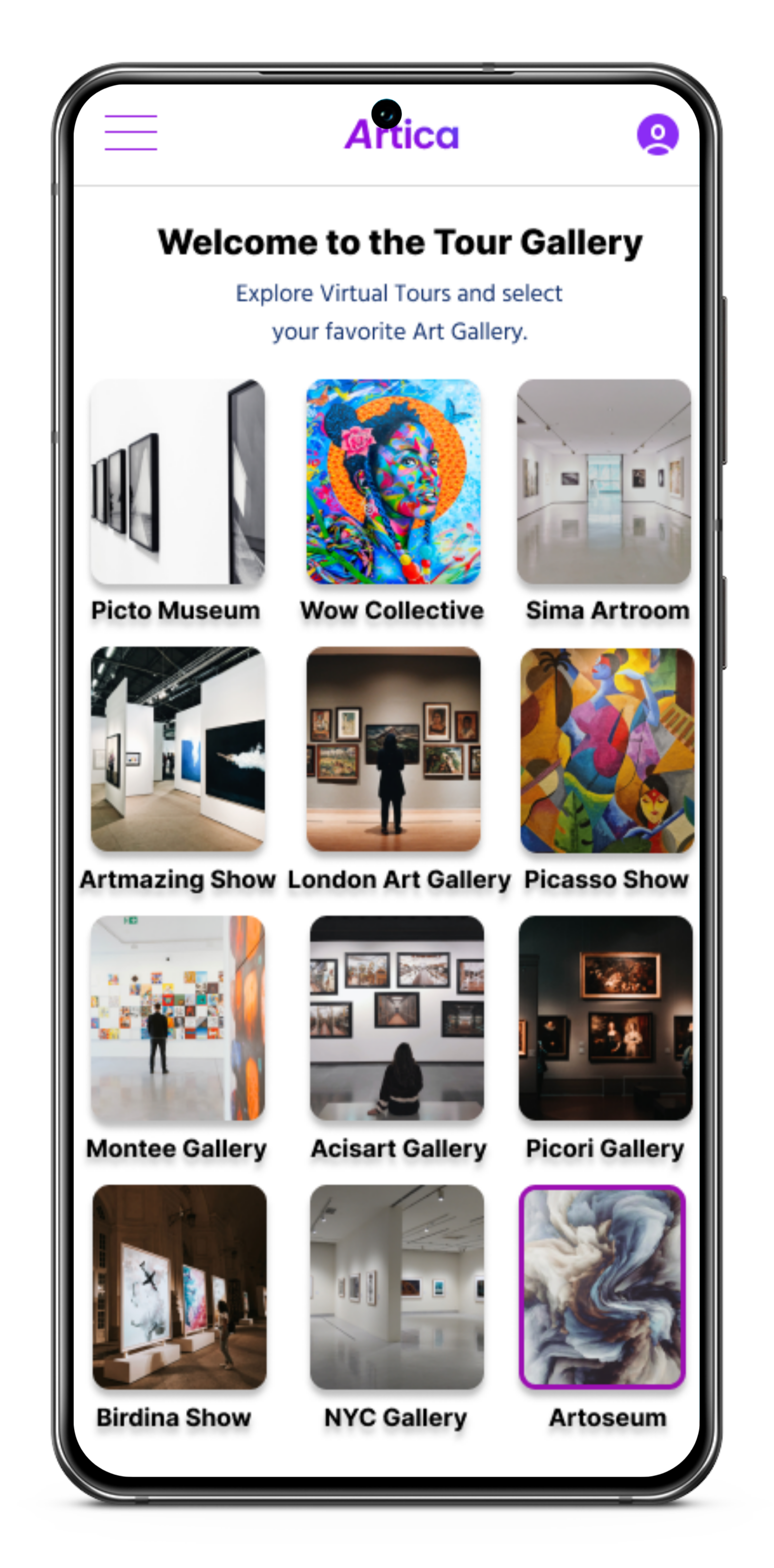
✅Solution: An app that offers virtual tours through art galleries. The Artica app connects art lovers with exhibitions all over the world for an affordable price. Assistive technology like a virtual tour guide makes it simple, comfortable, and easy to access for a wide audience.
I conducted interviews and created empathy maps to understand the users and their needs.
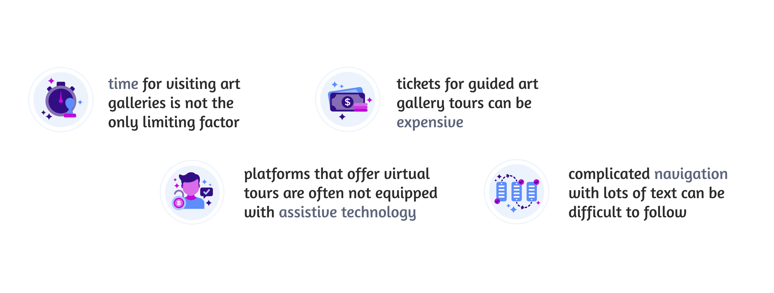
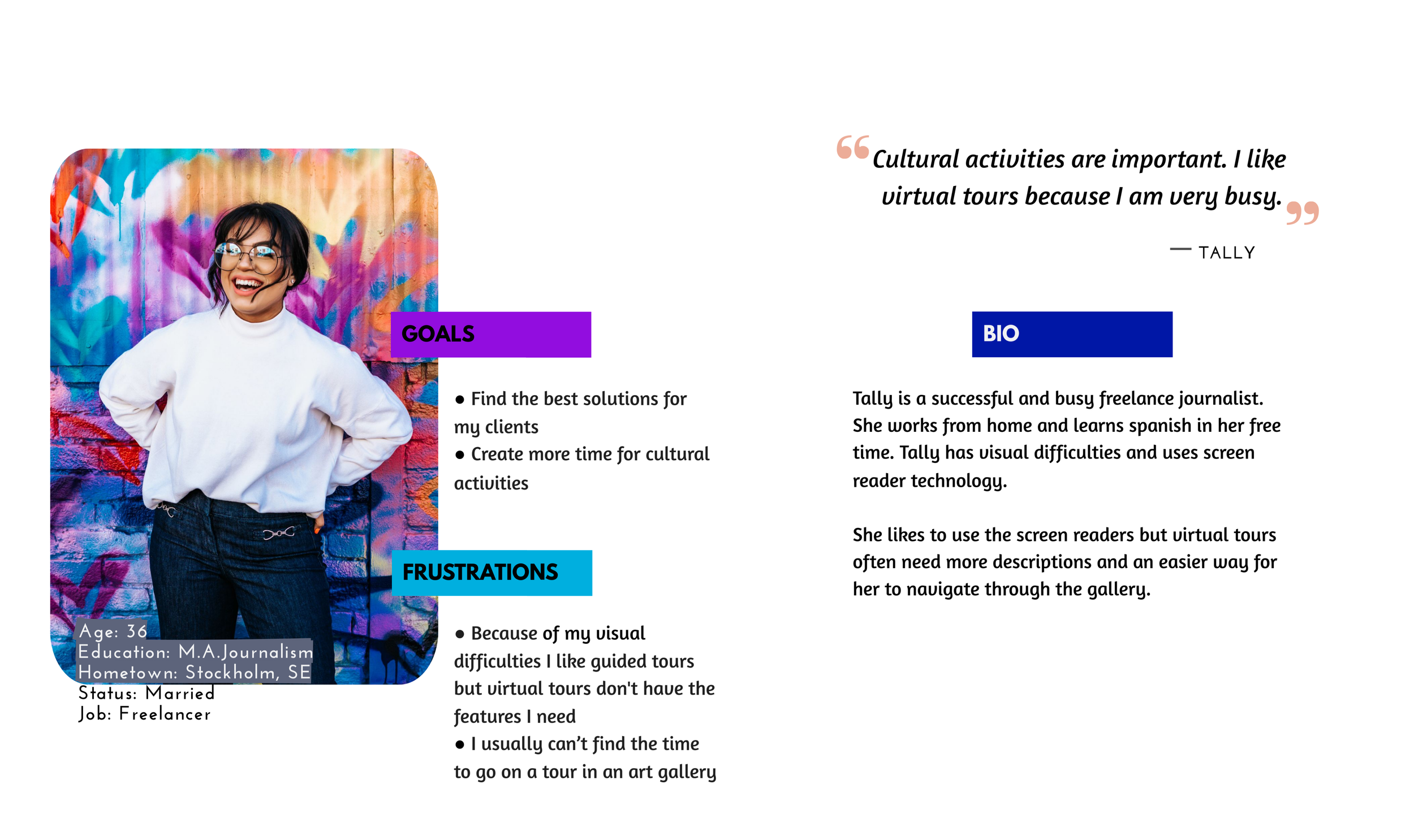
A primary user group identified was working adults who don‘t have much time for cultural activities like visiting art galleries.
Research also revealed:
research
personas
user flow
competetive audit
ArtPassport app
process
The results from the competitive audit revealed that the app content was often overwhelming and navigation complicated.
The goal of the design process was to make the tour selection easy, with a clear design and simple navigation.
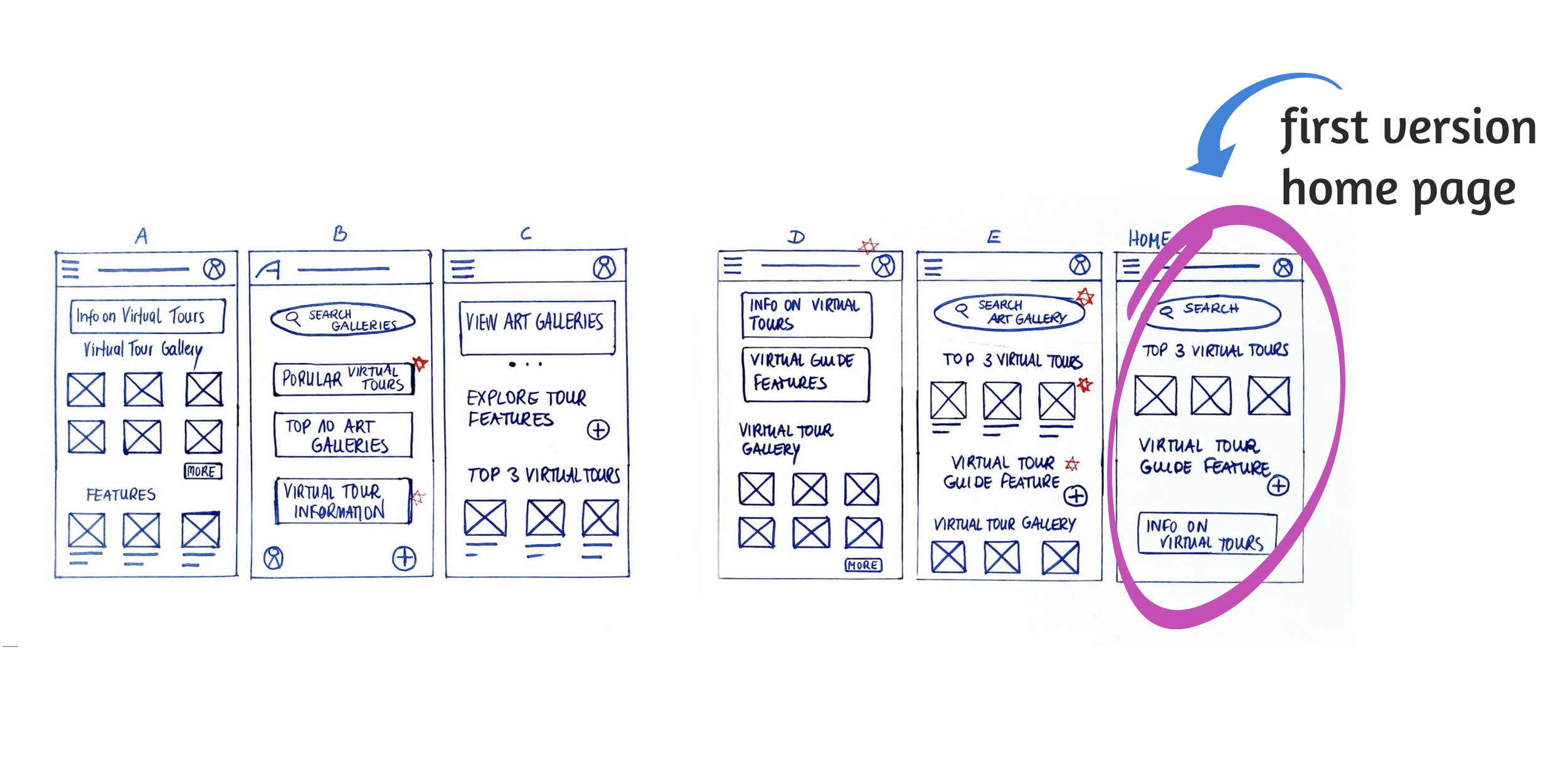
digital wireframes
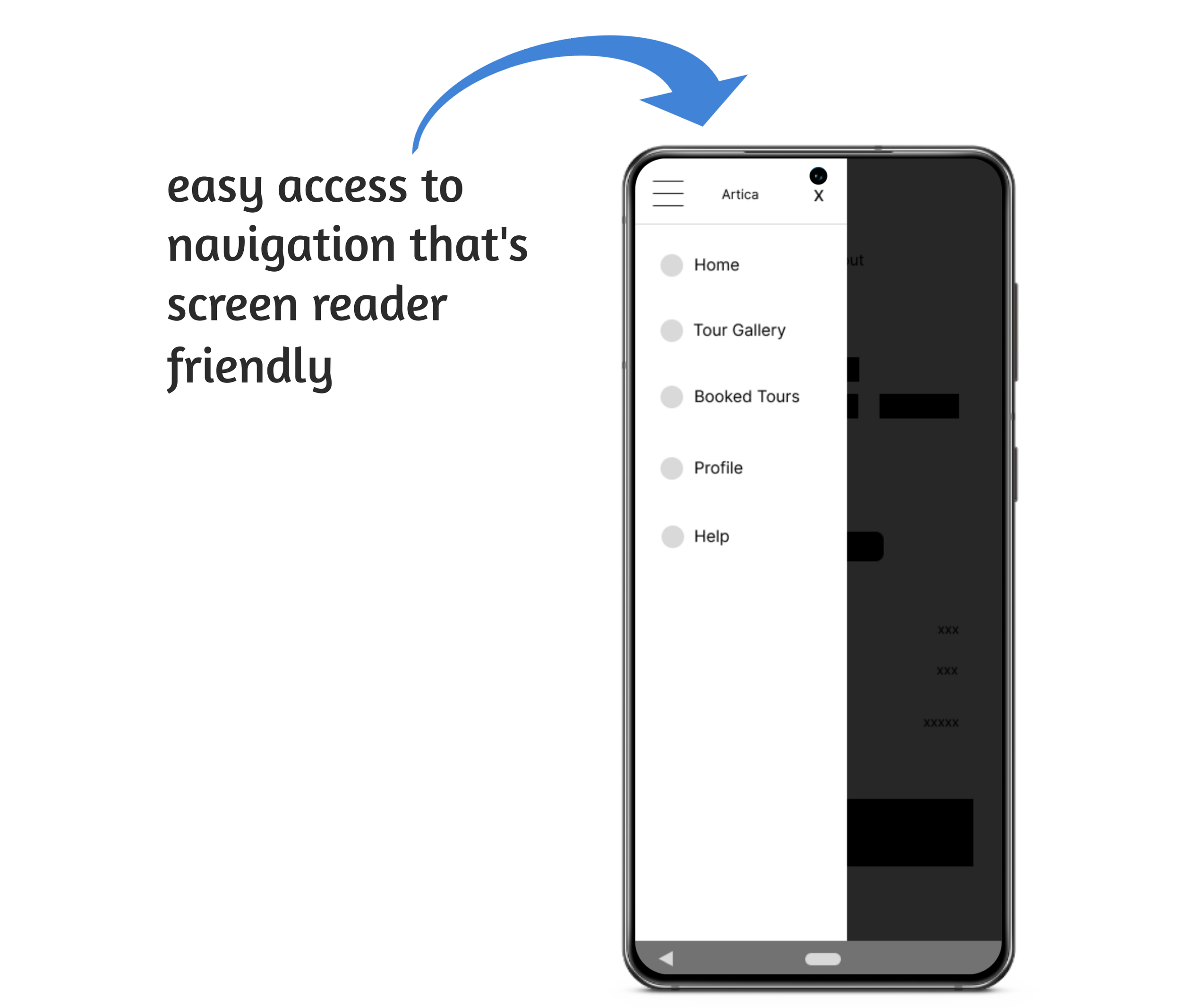
Easy navigation was a key user need to address in the designs, in addition to equipping the app to work with assistive technology.
low-fidelity prototype
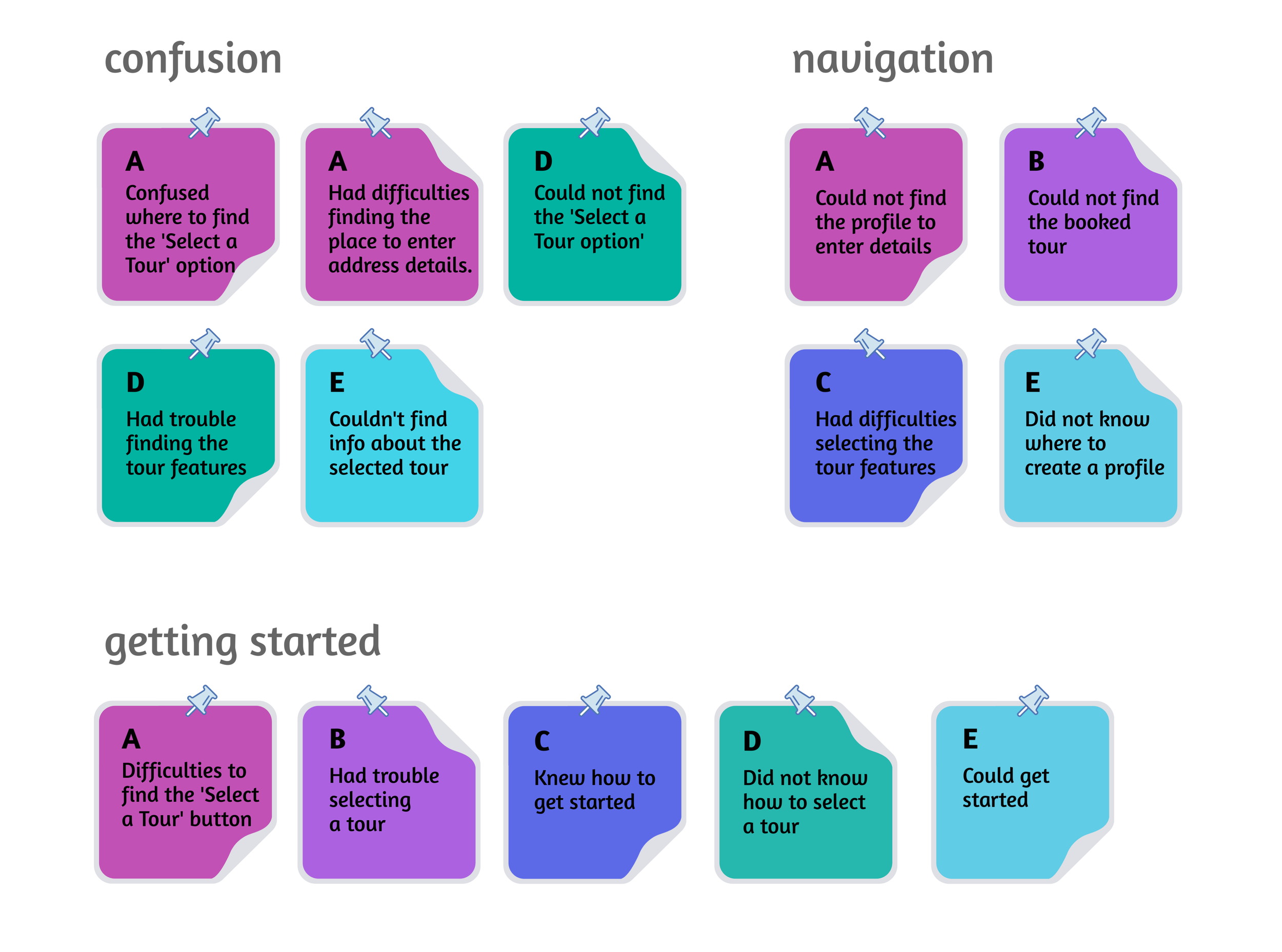
usability study findings
usability study
5 participants tested the low-fidelity prototype. I created an affinity diagram with the users difficulties, pain points and observations.
design phase
Where am I going now? After the research phase, the app design within figma with elements of design systems, a sticker sheet for components and styles like fonts and colours, became an exciting design journey.
Based on the usability study findings I created the first collection of mockups for the high-fidelity prototype.
before & after usability study
I added additional buttons to select a virtual tour and create a profile.
after usability study 2
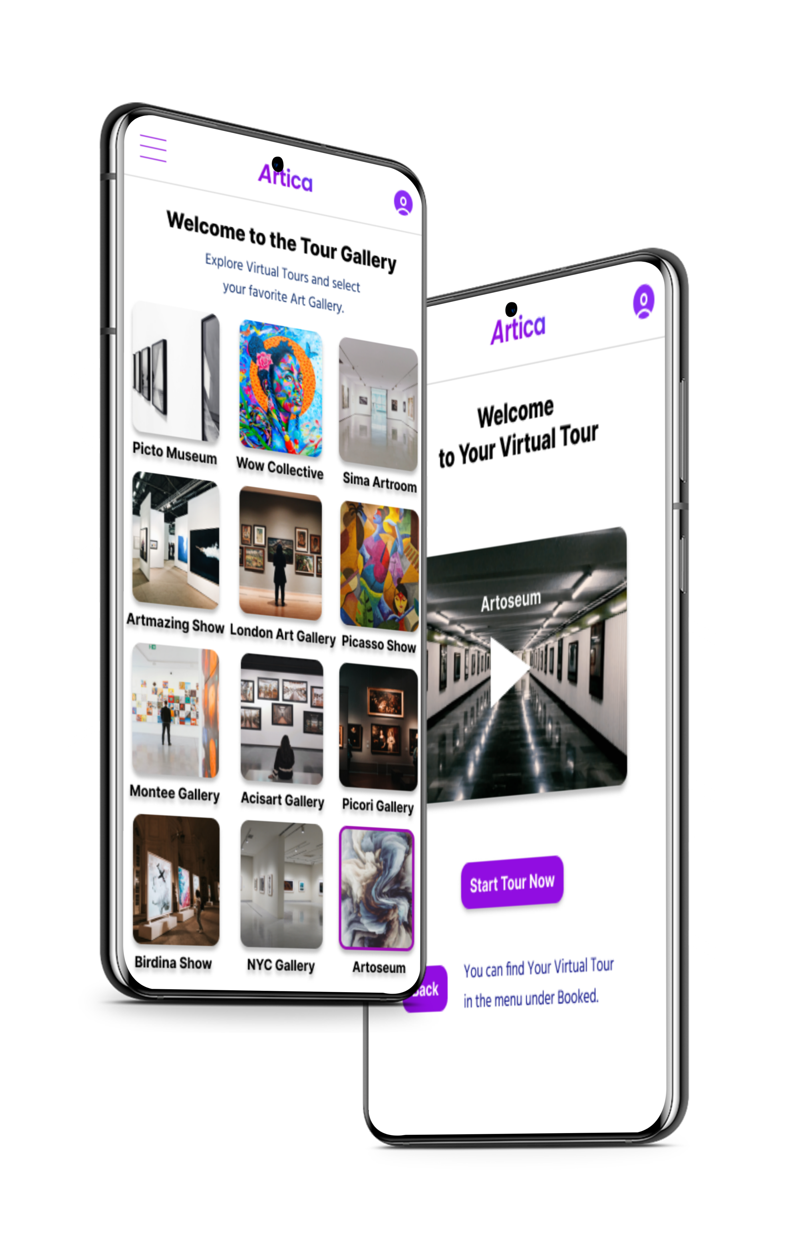
The second usability study revealed that a description of the art gallery tour was missing. I added a screen with the tour description.
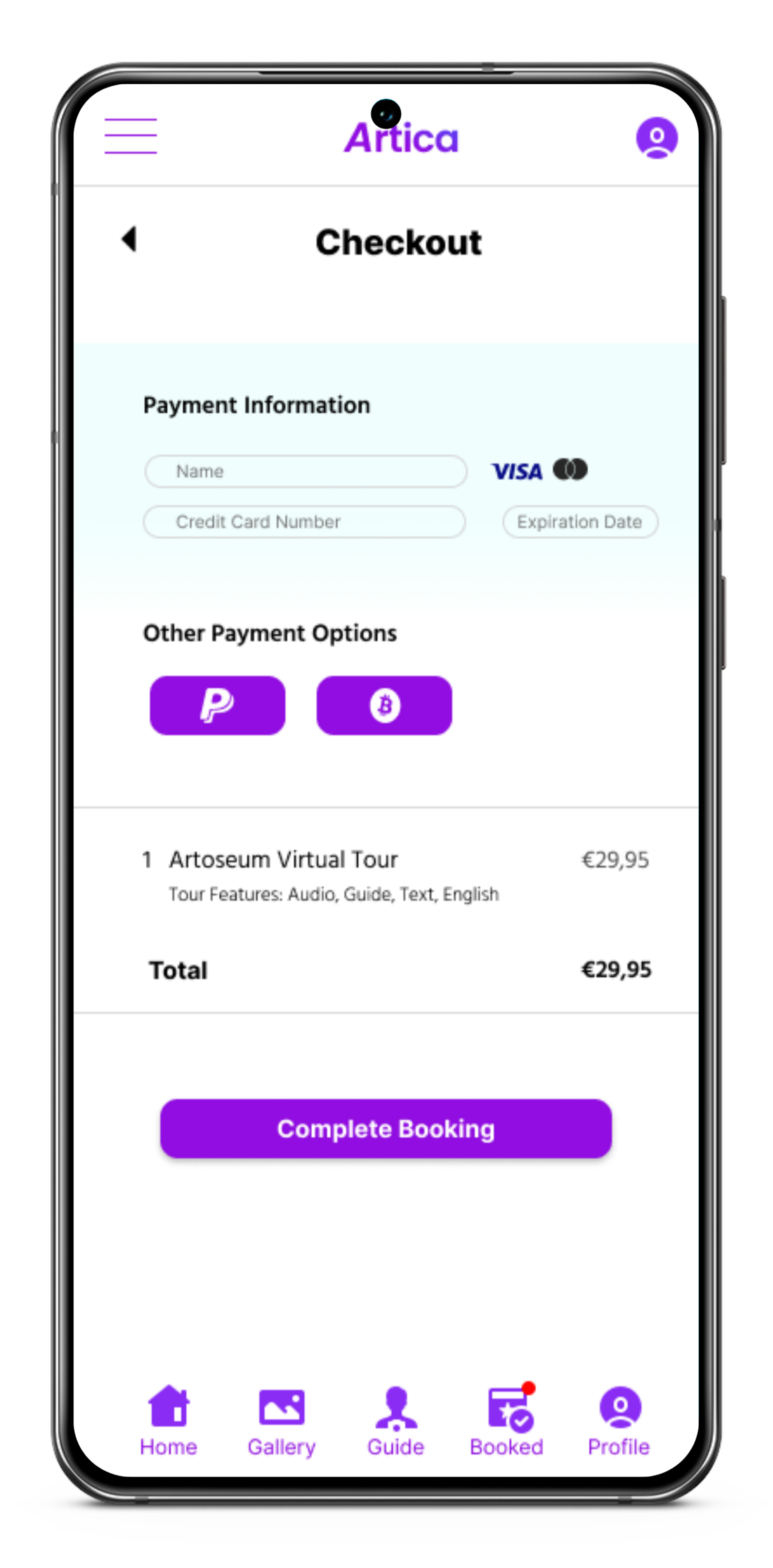
key mockups
accessibility considerations
takeaways
“I can imagine to use this app for a virtual tour. Great work!”
Impact:
The app makes the user’s feel that their needs are met, making the virtual tour experience as comfortable as possible.
What I learned:
While designing the Artica app, I learned that the first ideas for the app are only the beginning of the process. Usability studies and peer feedback influenced each iteration of the app’s designs.
Conduct another round of usability studies to validate whether the pain points users experienced have been effectively addressed.
Conduct more user research to determine any new areas of need.
Next steps:
Thank You!
Let’s connect!
Thank you for your time reviewing my work on the Artica Virtual Tour app!
Looking for a skilled designer? Contact me below:
